Luxor

LUXOR

I developed the conceptual design for a premier jewellery store named Luxor, focusing on clean, elegant aesthetics and a luxurious ambiance. My initial research for this project uncovered a significant interest in visualizing how jewellery would appear in real life. I then integrated an intuitive virtual try-on feature that was compatible across all devices.

Client

SOLO PROJECT

Role

UX DESIGNER

ROLE

2023

Tools

👩🏻‍💻 Project Overview

PROBLEM

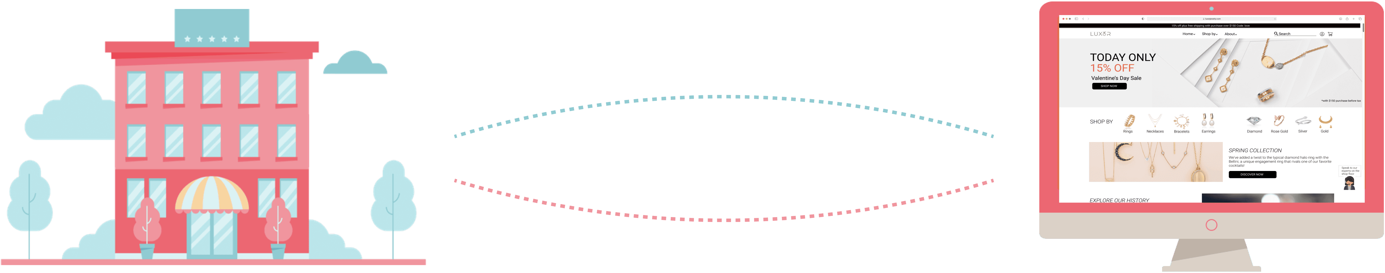
This project aimed to meet customer demands for the convenience of trying on jewellery at home or seeking an alternative when in-store experiences were unavailable, due to either personal preference or unexpected regulatory changes.


The challenge was how to seamlessly integrate the in-store experience digitally.


My initial research revealed a significant interest in visualizing how jewellery would look in real life.


To meet this need, I integrated an intuitive virtual try-on feature that was compatible across all devices. Additionally, three features were designed and implemented to bridge the gap between the physical retail environment and the digital realm, enhancing user engagement and satisfaction.

SOLUTION

✍️ Design Process

Research

· Secondary Research

· User Interview

Research

· Secondary Research

· User Interview

Ideate

· Problem Statement

· Sketch & ideate

Ideate

· Problem Statement

· Sketch & ideate

Test

· User feedback 

· Improvements

Test

· User feedback 

· Improvements

Design

· Final deliverables
· Clickable prototype

Design

· Final deliverables
· Clickable prototype

💻 Secondary Research

Research shows that despite the current low digital penetration in the luxury jewellery market, there is still significant online growth potential by integrating human-centred experiences on digital platforms.

Research shows that despite the current low digital penetration in the luxury jewellery market, there is still significant online growth potential by integrating human-centred experiences on digital platforms.

To start off, I conducted secondary research online to understand current jewellery market pain points and struggles, both online and in-store.

This is a screenshot of the 'World Energy Outlook 2023' published by the International Energy Agency (IEA).
This is a screenshot of the 'Annual Energy Outlook 2023' published by the U.S. Energy Information Administration.

Shift business online is needed for luxury industry's digital growth.


The COVID-19 pandemic exposed weakness in online sales accounted for just 13% for fine jewellery. The McKinsey study predicts that online fine jewellery sales will climb to 21% of the global market by 2025. To capture this opportunity, retailers and e-commerce companies should strategize on how to effectively attract and engage online customers.

Customers are seeking digitally enhanced yet human-centered experiences.

A Nutguru article addressed that 80% of purchases will continue to occur in physical stores. Therefore, customers will anticipate a top-notch level of service across both offline and online platforms, underscoring the significance of seamless integration is the key for business growth.


A Nutguru article addressed that 80% of purchases will continue to occur in physical stores. Therefore, customers will anticipate a top-notch level of service across both offline and online platforms, underscoring the significance of seamless integration is the key for business growth.


A Nutguru article addressed that 80% of purchases will continue to occur in physical stores. Therefore, customers will anticipate a top-notch level of service across both offline and online platforms, underscoring the significance of seamless integration is the key for business growth.


🔍 Primary Research

User interviews revealed a preference for in-store jewellery shopping due to the ability to try on pieces and receive personalized assistance.

User interviews revealed a preference for in-store jewellery shopping due to the ability to try on pieces and receive personalized assistance.

I fine-tuned the research scope through stakeholder interviews, effectively balancing detailed inquiries with focus on evaluating usability and navigational design.

To learn more about the user needs, I conducted an interview with six participants (two males and four females) whose ages ranged from 20 to 45. The interview was semi-structured, with pre-defined questions and open-ended questions to discover the pros and cons of both in-store and online shopping experiences for purchasing jewellery.

Participants

6 Participants

User Interview

Semi-structured

Tools

Zoom

Interview Results

​​For in-store experience:

✅ Out of six participants, five preferred to purchase jewellery in-store because they had the opportunity to try on and visually examine the pieces (5 out of 6).


💬 Additionally, participants were drawn to the in-store shopping experience due to the personalized assistance (3 out of 6) and comprehensive information provided by the sales associates (3 out of 6).

​​For online experience:

✅ Participants praised the online platforms for its intuitive pricing (5 out of 6), and convenient purchasing experience (4 out of 6).


💬 One participant also highlighted the importance of supporting small businesses online (1 out of 6).

🤔 Ideation

How might we seamlessly integrate the in-store experience into a digital platform to allows customers try on jewellery at the convenience of their home?

How might we seamlessly integrate the in-store experience into a digital platform to allows customers try on jewellery at the convenience of their home?

Ideate solutions:

After several rounds of sketches and ideation, three features were designed in order to address the problem.

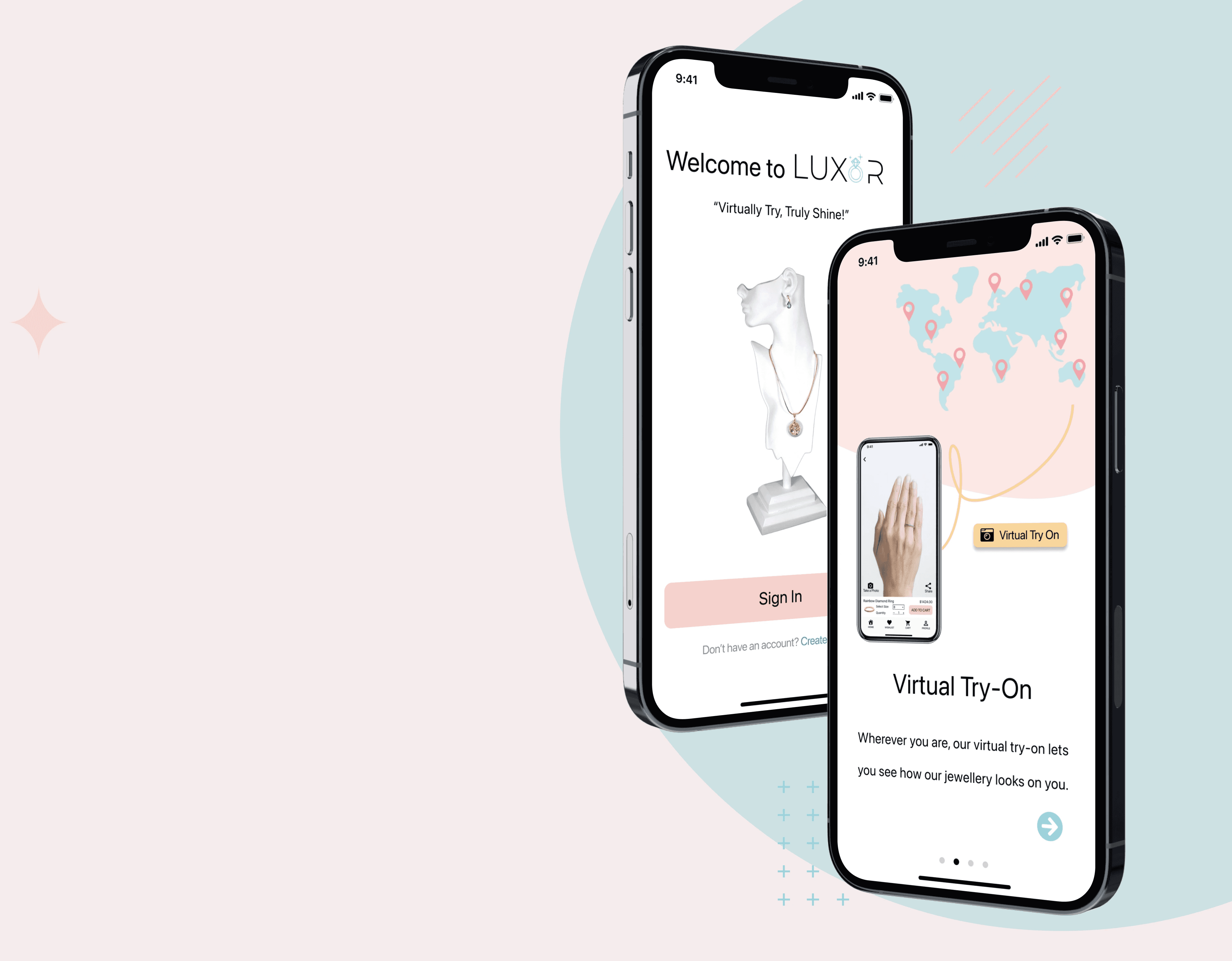
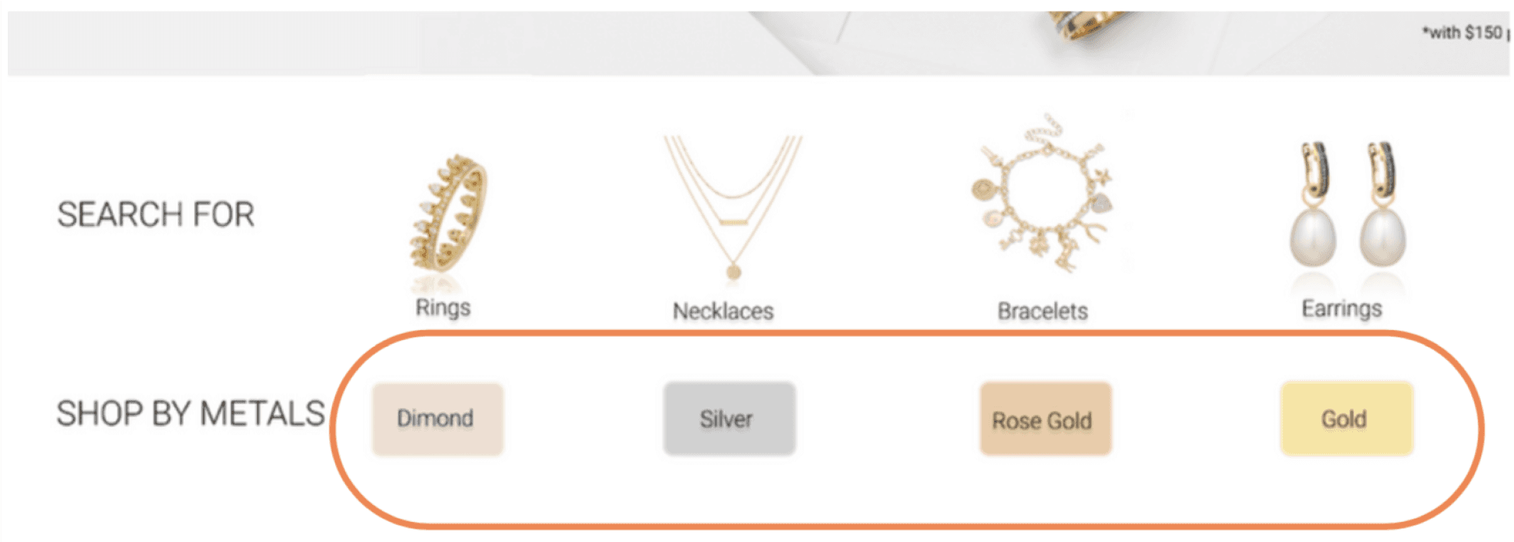
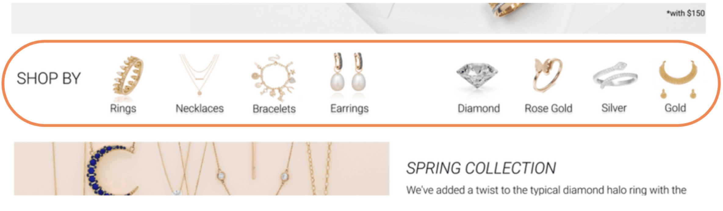
Virtual try-on tool:


Every product page features a virtual try-on tool, allowing customers to try on jewellery for at-home convenience or when in-store trials are limited. Users can click the 'try-on' button to see the jewellery piece on through AR or upload a photo for a virtual try-on experience.

Item description video:


Each product description page includes a item description video, providing an immersive showcase of the details of the item.

Online sales assistant:


An online sales assistant is there to provide product information and real-time support, accessible via a button in the bottom right corner for real-time assistance.

Test

Iterative testing and improvements based on user feedback have significantly enhanced the usability and aesthetics of mobile and web user interfaces.

After creating mobile and web UI mockups with a primary focus on the 3 key concepts/features mentioned above, a simple user feedback session was conducted for further iteration and refinement of the design.

This test primarily focused on evaluating the UI design and overall aesthetics. Three major changes have been made after the test.
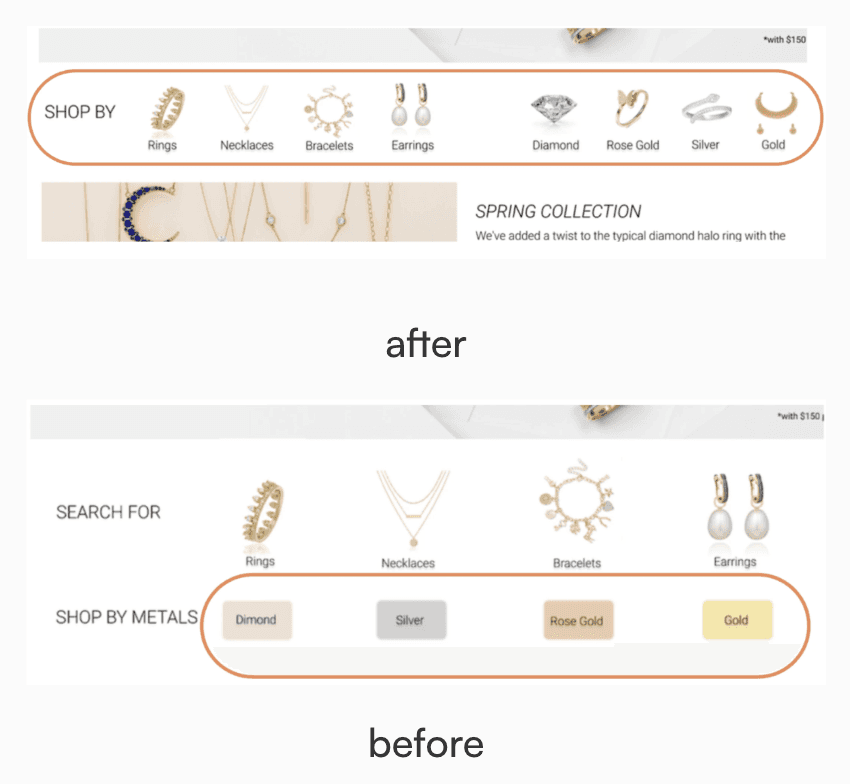
Improvement 1: consistent look and feel

Participants suggested that the "shop by metals" categories were not presented intuitively enough in the previous version, and they could be easily overlooked. Therefore, in the new iteration, they are now displayed in both pictures and headings to give a more consistent look and feel.

before

after

Improvement 2: clarity of the message

The most mentioned feedback was that the illustrations on the splash screens for the mobile version did not effectively communicate the onboarding message. Also, a straightforward sentence explaining the titles "discovery" and "easy payment" would be beneficial during the onboarding process. Based on this feedback, the illustrations were redesigned, and concise sentences were included to improve the clarity of the message that the brand is trying to deliver.

before

after

Improvement 3: button redesign

The initial hand icon for the "virtual try-on" button was found to be confusing and reminiscent of a "tap to stop" gesture according to user feedback. The icon was replaced with a camera-like button with "try-on" text for clearer functionality. Additionally, the button was strategically placed near the product name and image making it easily accessible when users want to virtually try on the product.

before

after

Improvement 1:
consistent look and feel

Participants suggested that the "shop by metals" categories were not presented intuitively enough in the previous version, and they could be easily overlooked. Therefore, in the new iteration, they are now displayed in both pictures and headings to give a more consistent look and feel.

Improvement 2:
clarity of the message

The most mentioned feedback was that the illustrations on the splash screens for the mobile version did not effectively communicate the onboarding message. Also, a straightforward sentence explaining the titles "discovery" and "easy payment" would be beneficial during the onboarding process. Based on this feedback, the illustrations were redesigned, and concise sentences were included to improve the clarity of the message that the brand is trying to deliver.

Improvement 3:
button redesign

The initial hand icon for the "virtual try-on" button was found to be confusing and reminiscent of a "tap to stop" gesture according to user feedback. The icon was replaced with a camera-like button with "try-on" text for clearer functionality. Additionally, the button was strategically placed near the product name and image making it easily accessible when users want to virtually try on the product.

🎨 Design Solutions

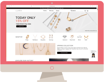
3 features were developed to seamlessly connect physical and digital shopping experiences, enhancing customer engagement and helping retailers adapt to the changing retail landscape.

Virtual try-on tool

See it virtually how different pieces of jewellery would look like on you.

Item description video

Get in-depth product info from a jewellery expert.

Virtual sales associate

Ask a sales associate anything, just like you would for in-store assistance.

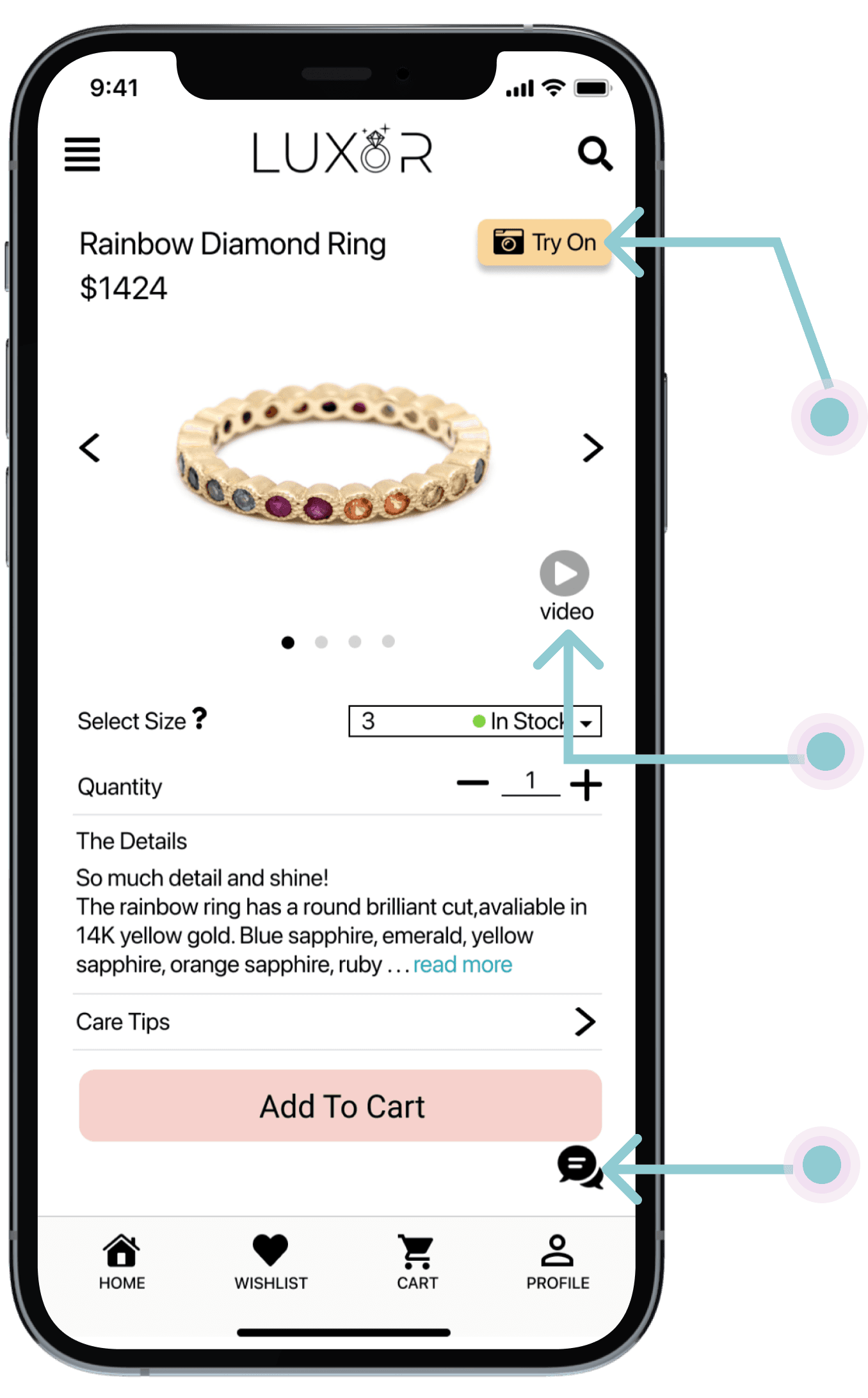
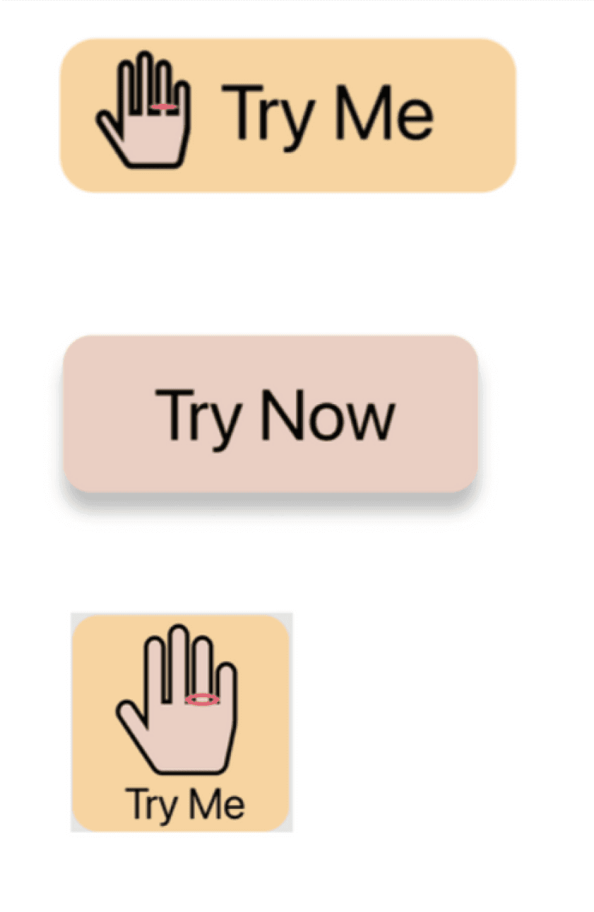
Feature 1: Virtual try-on tool

Step 1:
The user clicks the “try this ring on virtually” button from the product page.
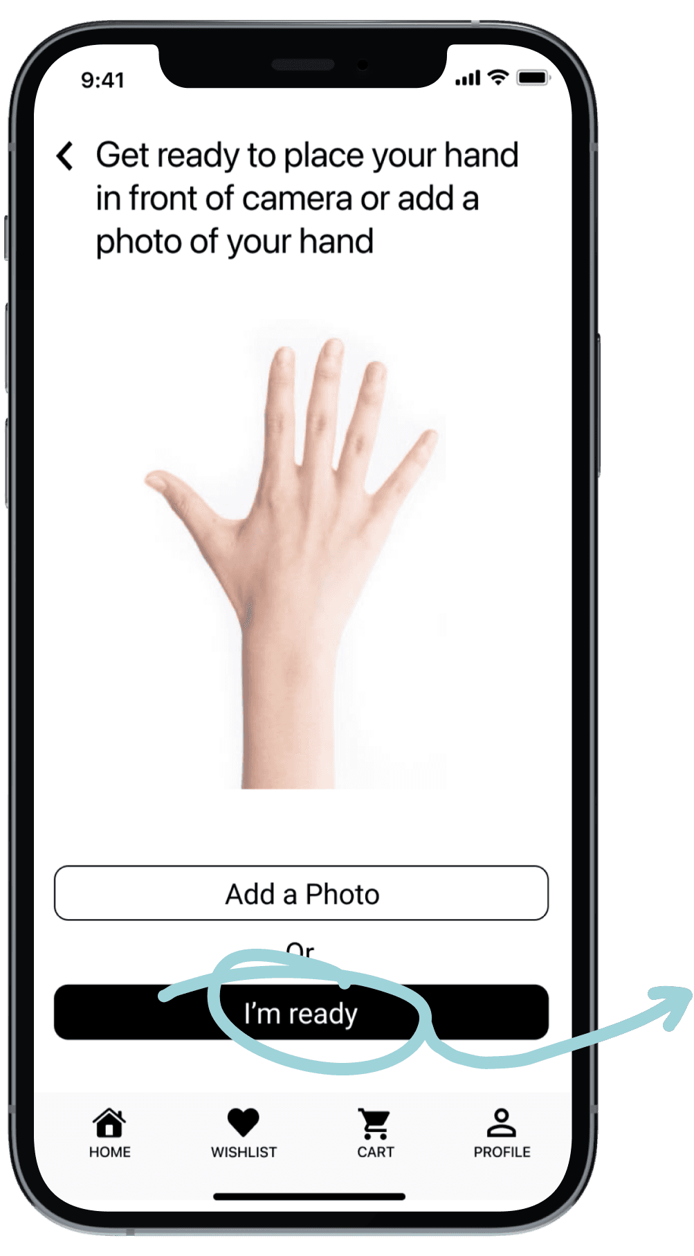
Step 2:
An instruction is displayed asking the user to upload a photo of their hand or turn on the camera.

Step 3:
The user can take a picture with the product on or send a picture to someone. The user can add the item to the cart while virtually trying it on.

Feature 2: Virtual sales associate

Step 1:
The user can get immediate help from a real sales associate by clicking the customer support icon located at the bottom right corner of every webpage.

Step 2:
A knowledgeable sales associate will provide real-time assistance to the user.

Feature 3: item description video

Step 1:
Every product page displays comprehensive information about an item. The user can get an even deeper understanding of the product by clicking on the product video.

Step 2:
A jewellery expert will present a descriptive video about the product, offering information similar to what a customer would receive from an in-store salesperson.

Back To Top

Back To Top

🩷 Final Design

💜 Final Design

🙌 Project Reflection

Designing outside comfort zone.

Working on this project has expanded my understanding of the limitations surrounding online jewellery shopping experience. Finding the right features that solved the users problem was challenging, but this project helped me get out of my comfort zone & challenge myself to deliver user centric solutions.


More support and testing.

It would be awesome to get some help with the actual virtual reality implementation. And there are still a lot of inputs & features that could be added with further testing and identifying the problem with the help of more user data.

designing experience that resonate

@2024 Iris Song

designing experience that resonate

@2024 Iris Song

designing experience that resonate

@2024 Iris Song

designing experience that resonate

@2024 Iris Song

Go Back To Top

Go Back To Top