ENERGY FUTURE

ENERGY FUTURE

I led the redesign of the "Canada's Energy Future 2023" web product. The user research indicated a strong preference for PDF formats due to the content-heavy nature of the website. A design improvement was then made to the new launch for enhanced navigation and readability.

Client

Canada Energy Regulator

Role

UX DESIGNER + RESEARCHER

ROLE

2023

Tools

ENERGY FUTURE

ENERGY FUTURE

I led the redesign of the "Canada's Energy Future 2023" web product. The user research indicated a strong preference for PDF formats due to the content-heavy nature of the website. A design improvement was then made to the new launch for enhanced navigation and readability.

Client

Canada Energy Regulator

Role

UX DESIGNER + RESEARCHER

ROLE

2023

Tools

👩🏻‍💻 Project Overview

BACKGROUND

Every year Canada’s Energy Regulator publishes one of their flagship publication - Canada’s Energy Future Report.


Canada’s Energy Future is a series of reports that analyze and provide data on all provinces and territories, and all energy commodities. For the past few years, it has been launched digitally in both PDF and the web format.


After the previous product launch, web traffic analysis showed a high number of PDF report downloads but low page views, suggesting that visitors were either not engaged or found the content challenging to navigate.

The research was then focused on uncovering the reason for user abandonment, identifying existing navigation challenges, and exploring effective design solutions for content-heavy web pages.


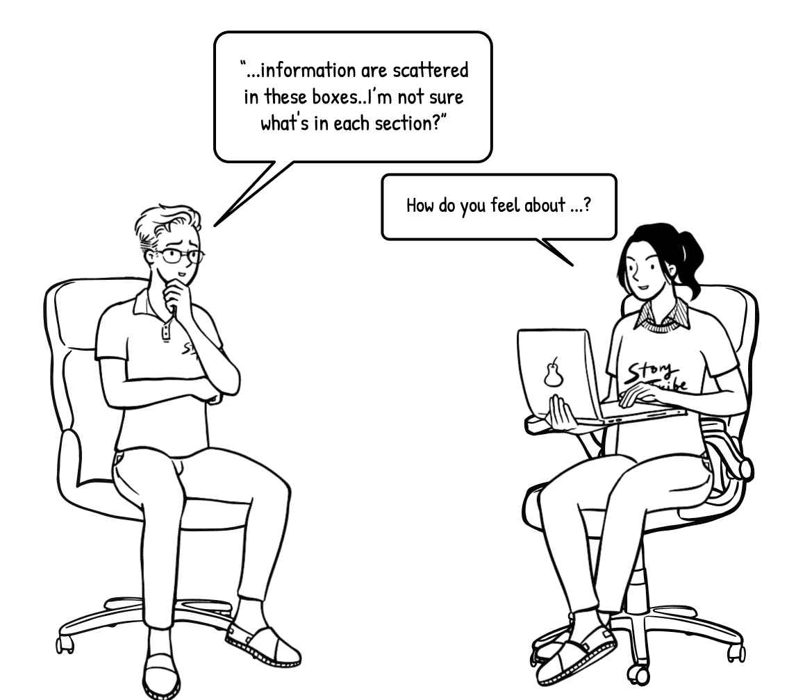
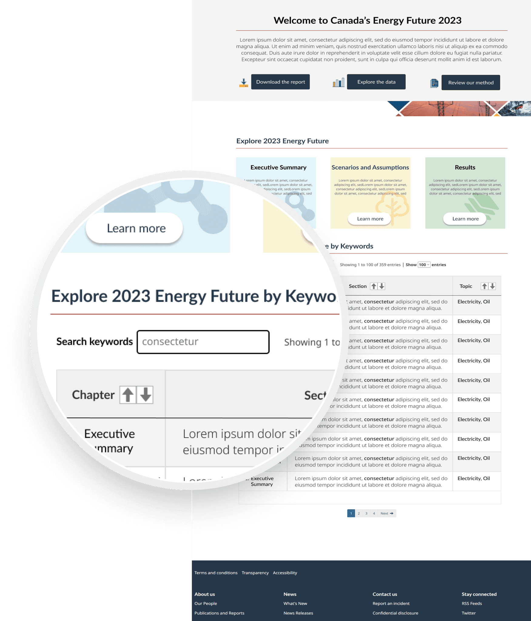
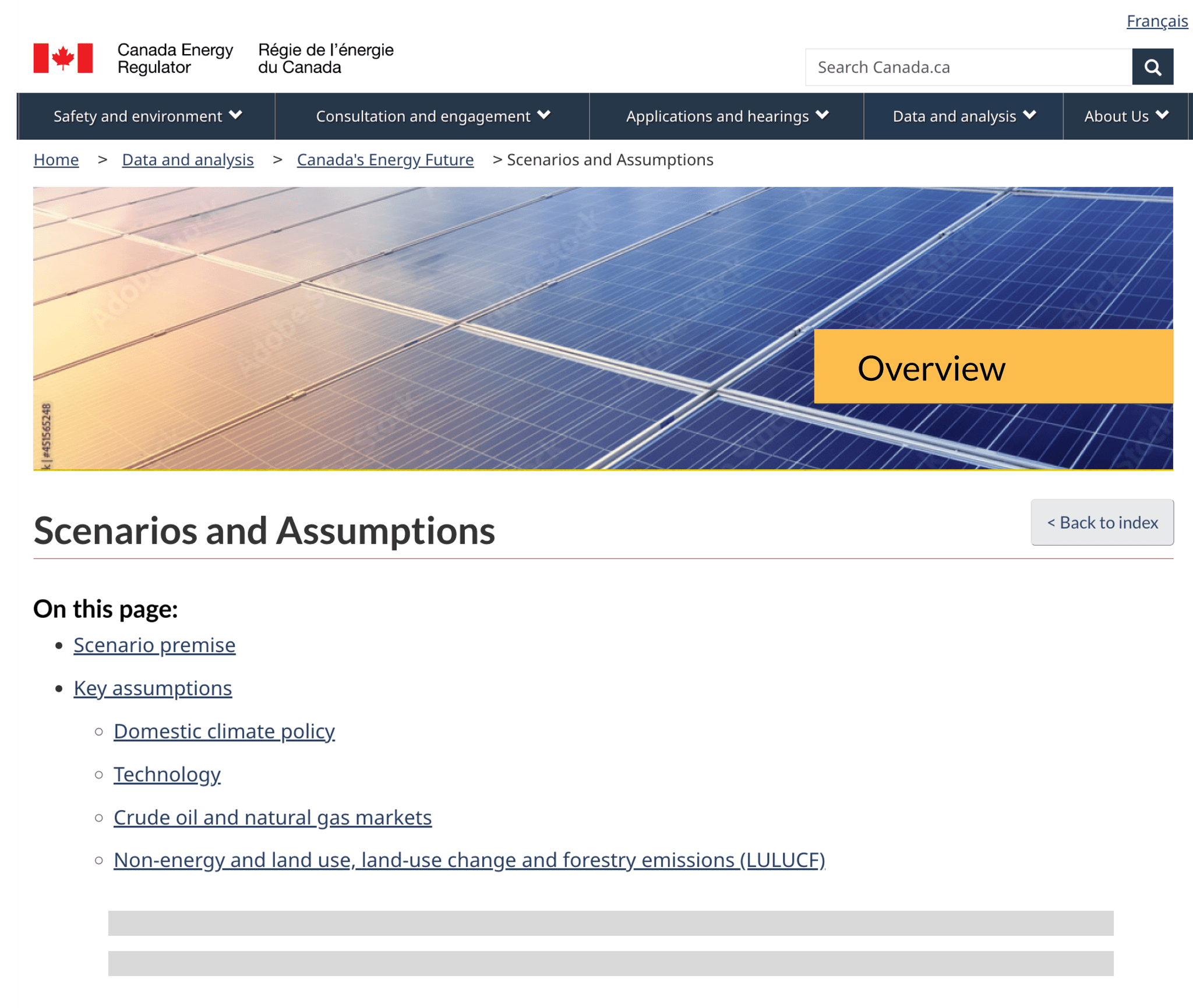
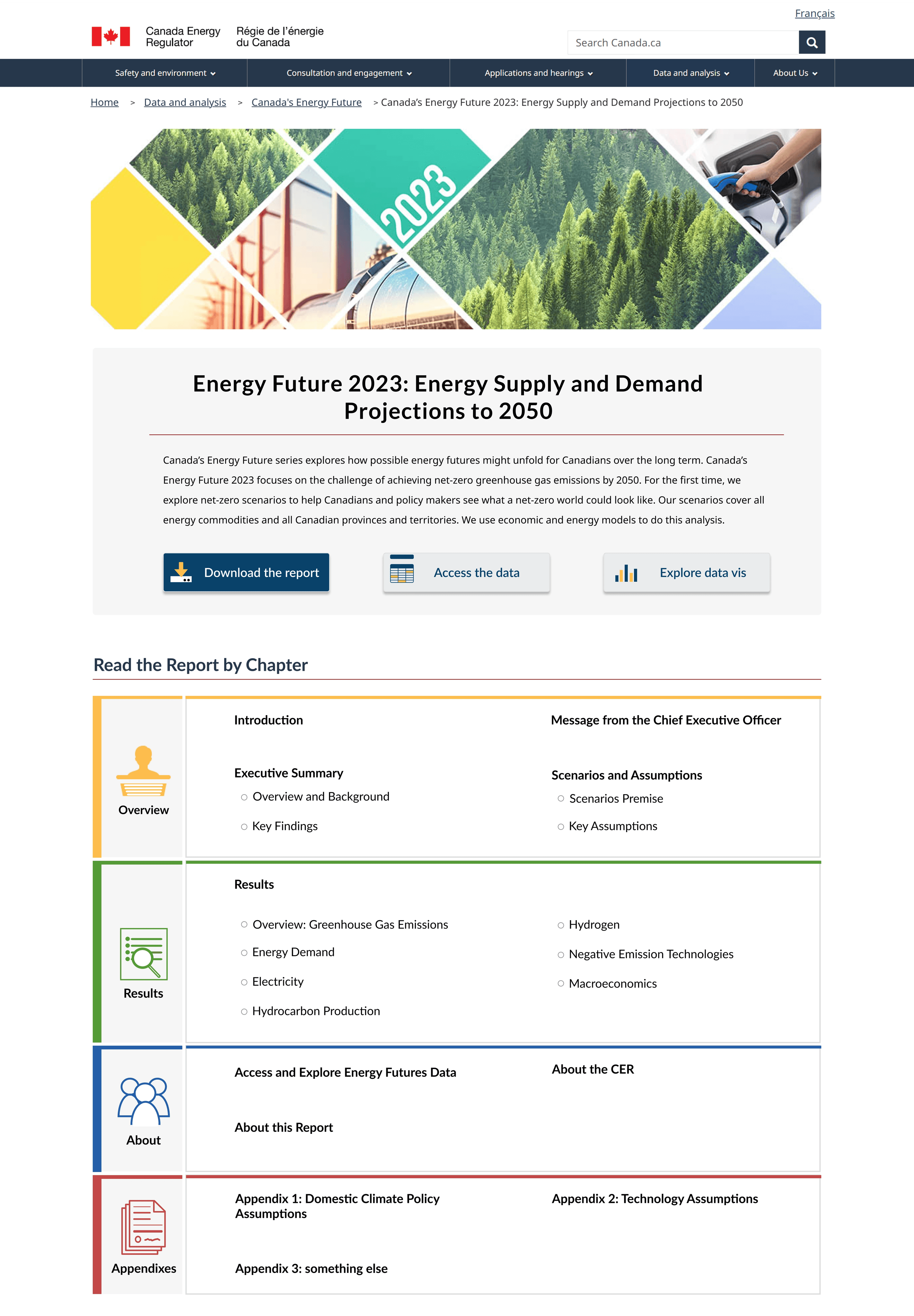
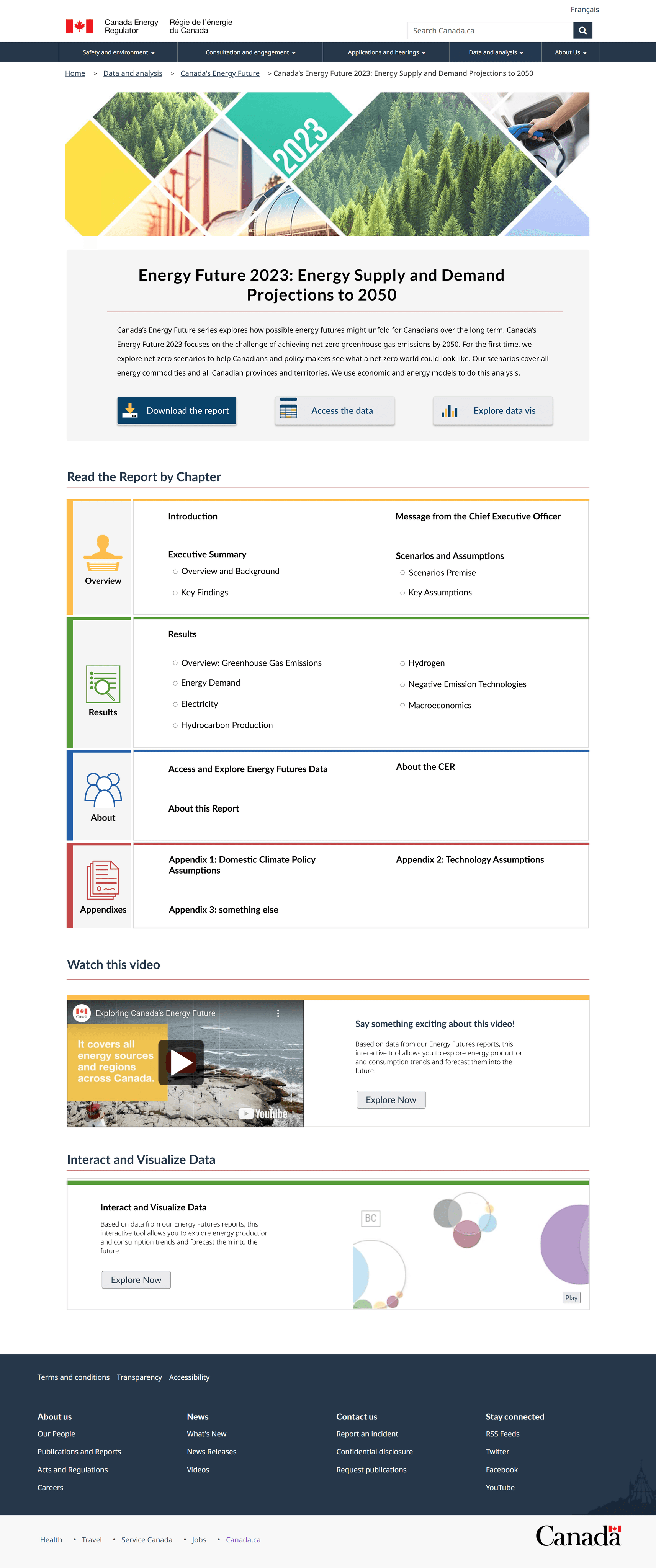
Usability studies revealed that users struggled with navigating and locating information on content-heavy pages, and they preferred a linear and hierarchical design.

PROBLEM

SOLUTION

In response, I redesigned the landing page by incorporating binder tabs to clarify the relationship between parent and child pages and introduced in-page links for quick overviews and direct access to specific sections.


Following these changes, there was a significant improvement in user satisfaction with both navigation and readability.


✍️ Design Process

Discover

· Interview stakeholders
· Gather requirements
· Define research scope
· Define study method

Discover

· Interview stakeholders
· Gather requirements
· Define research scope
· Define study method

Test

· Design study plan

· Run pilot study
· Recruit participants
· Implement study

Test

· Design study plan

· Run pilot study
· Recruit participants
· Implement study

Analysis

· Transcribe data
· Code data
· Identify themes
· Analyze data

Analysis

· Transcribe data
· Code data
· Identify themes
· Analyze data

Design

· Ideate solutions
· Draft wireframe
· Deliver final prototype
· Design documentation

Design

· Ideate solutions
· Draft wireframe
· Deliver final prototype
· Design documentation

🔍 Secondary Research

Competitive analysis suggests that a simple, straightforward, and accessible design is crucial for user engagement and information retrieval.

Competitive analysis suggests that a simple, straightforward, and accessible design is crucial for user engagement and information retrieval.

To start off, I conducted a competitive analysis of two leading organizations in the energy sector that publish similar reports in both PDF and HTML formats.

This is a screenshot of the 'World Energy Outlook 2023' published by the International Energy Agency (IEA).
This is a screenshot of the 'Annual Energy Outlook 2023' published by the U.S. Energy Information Administration.
This is a screenshot of the 'World Energy Outlook 2023' published by the International Energy Agency (IEA).

👍 Pros:

· Simple, linear design emphasizing key sections like the table of contents, methodology, and data.


· Collapsible navigation on child pages effectively demonstrates the hierarchy between pages.


· Summarizing key report highlights reduces the overload of information, catering to those needing just a top-level overview.

👎 Cons:

· The concise presentation may lack detailed information needed by some users.

This is a screenshot of the 'Annual Energy Outlook 2023' published by the U.S. Energy Information Administration.

👍 Pros:

· Hamburger menu for easy access to the table of contents and other sections, enhancing navigation.


· Single scrolling page format facilitates quick keyword searches.

👎 Cons:

· The long scrolling page format can overwhelm users with too much information at once.

👍 Pros:

· Simple, linear design emphasizing key sections like the table of contents, methodology, and data.


· Collapsible navigation on child pages effectively demonstrates the hierarchy between pages.


· Summarizing key report highlights reduces the overload of information, catering to those needing just a top-level overview.

👎 Cons:

· The concise presentation may lack detailed information needed by some users.

👍 Pros:

· Hamburger menu for easy access to the table of contents and other sections, enhancing navigation.


· Single scrolling page format facilitates quick keyword searches.

👎 Cons:

· The long scrolling page format can overwhelm users with too much information at once.

✍️ Research Planning

I fine-tuned the research scope through stakeholder interviews, effectively balancing detailed inquiries with focus on evaluating usability and navigational design.

I fine-tuned the research scope through stakeholder interviews, effectively balancing detailed inquiries with focus on evaluating usability and navigational design.

I fine-tuned the research scope through stakeholder interviews, effectively balancing detailed inquiries with focus on evaluating usability and navigational design.

Building on the insights from my preliminary research, I scheduled a stakeholder interviews by reaching out to stakeholders and product owners, who are also the content creators of the EF report, to discuss my proposed approach for testing and to gather more information about the upcoming publication.

Gather requirements & define research scope

After presenting the initial study plan focused on usability, the stakeholders were keen to hear what users thought about the content. So, I added a few introductory questions to satisfy their curiosity but made sure it didn't shift our main aim of assessing usability.

💻 Usability Testing

In collaboration with product owners, I crafted 5 usability tasks incorporating scenarios with specific end goals to assess user interaction and navigation through the HTML page.

In collaboration with product owners, I crafted 5 usability tasks incorporating scenarios with specific end goals to assess user interaction and navigation through the HTML page.

Refine the research plan with a focused objective

Leveraging insights from these engagements, the team agreed to conduct usability testing focused on navigation and readability for the 2021 version of the Energy Futures landing page and its child pages.

1

hour testing session

· 4 warm-up interview questions
· 5 usability tasks
· 3 post-test interview questions

2

Research Questions

· How are people navigating and using the Canada’s Energy Future reports?
· Why does our audience prefer downloading and reading PDF over a web page?

8

Participants

· French and English speakers
· Geographically diverse within Canada 
· NGO’s, academia, industry specialists, government employees, non-experts

1

hour session

· 4 warm-up interview questions
· 5 usability tasks
· 3 post-test interview questions

· 4 warm-up interview questions
· 5 usability tasks
· 3 post-test interview questions

2

Research Questions

· How are people navigating and using the Canada’s Energy Future reports?
· Why does our audience prefer downloading and reading PDF over a web page?

· How are people navigating and using the Canada’s Energy Future reports?
· Why does our audience prefer downloading and reading PDF over a web page?

8

Participants

· French and English speakers
· Geographically diverse within Canada 
· NGO’s, academia, industry specialists, government employees, non-experts

· French and English speakers
· Geographically diverse within Canada 
· NGO’s, academia, industry specialists, government employees, non-experts

One Example of a Usability Task


Goal: content findability (via buttons, headers, layout, etc.)


Topics: Macroeconomics


Scenario: You are looking for the results of the EF2021 projections with a primary interest in how economics plays a role and how it will influence future trends for the energy future system.


Question: Can you please show me how you would find information on macroeconomics from this landing page?

1

hour session

· 4 warm-up interview questions
· 5 usability tasks
· 3 post-test interview questions

2

Research Questions

· How are people navigating and using the Canada’s Energy Future reports?
· Why does our audience prefer downloading and reading PDF over a web page?

8

Participants

· French and English speakers
· Geographically diverse within Canada 
· NGO’s, academia, industry specialists, government employees, non-experts

Key Insights

Research revealed that users preferred not just the PDF format but the linear and hierarchical design, which made handling content-heavy webpages easier.

Research revealed that users preferred not just the PDF format but the linear and hierarchical design, which made handling content-heavy webpages easier.

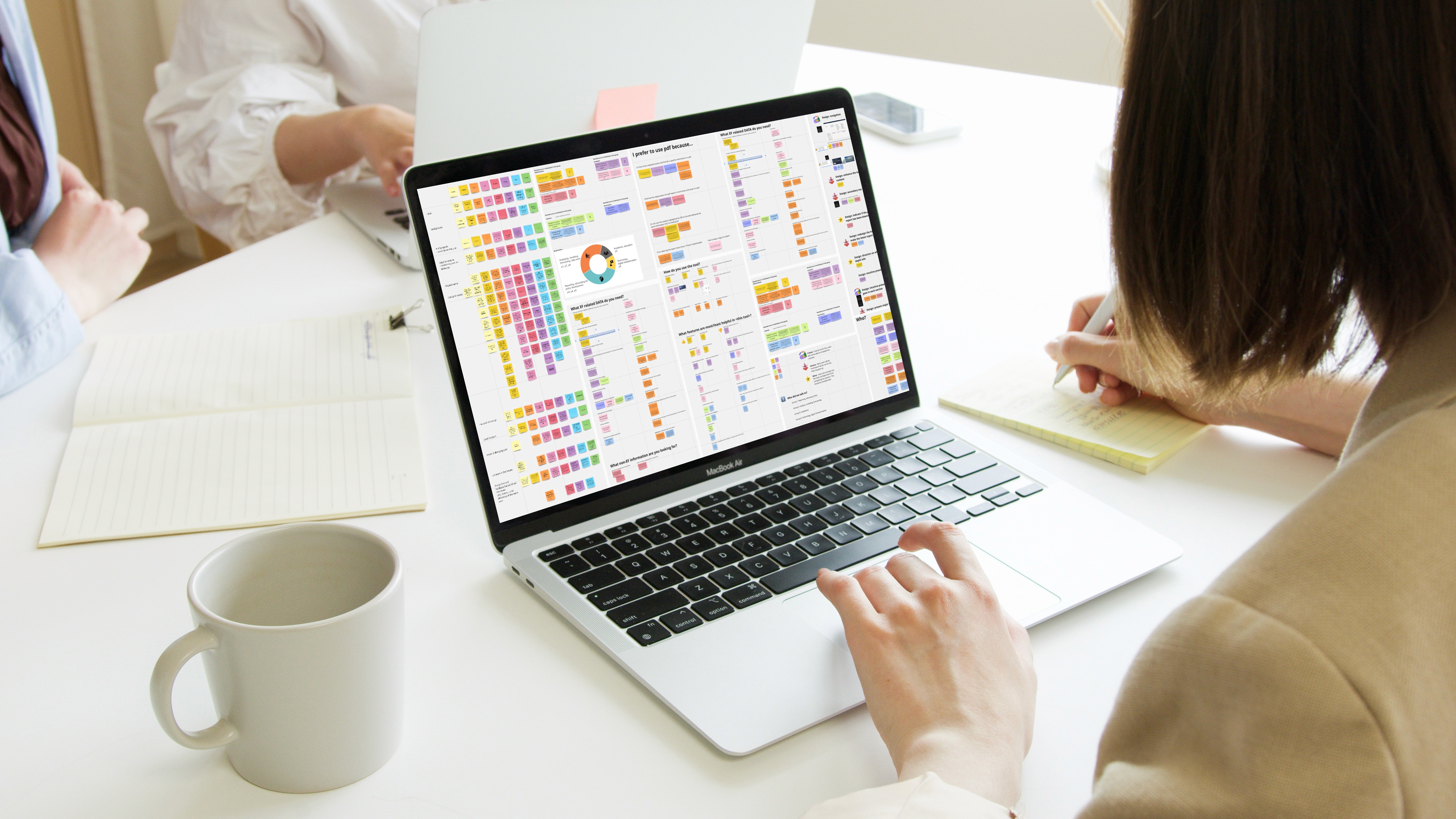
Following the study, I transcribed, coded, and analyzed the interview data, identifying several critical issues. Here are the top 3 pain points that need immediate prioritization for a design solution:

1️⃣ linear and hierarchical designs were highly favoured

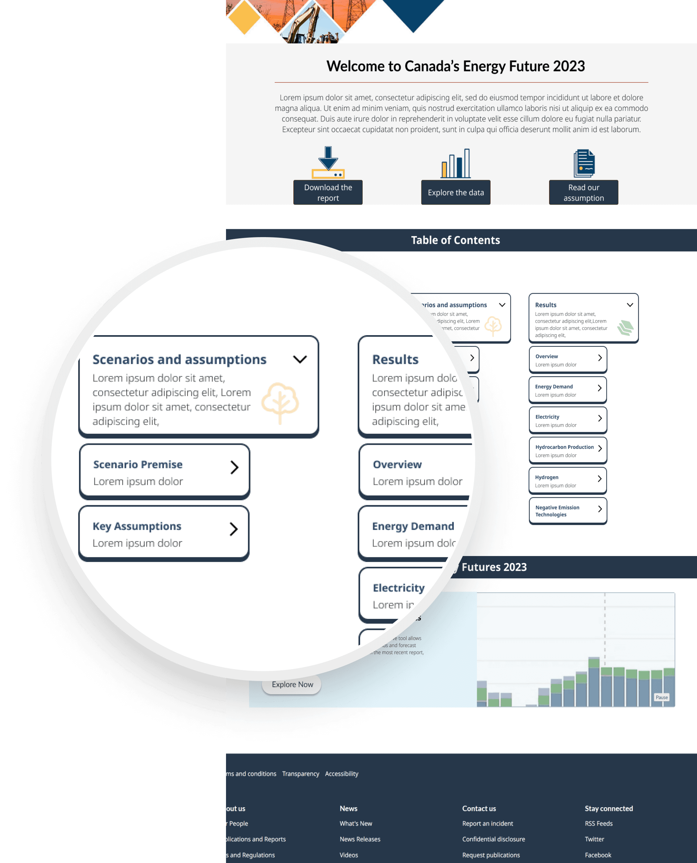
The usability testing results confirmed our traffic data observations: users found navigating and locating information more efficient in the PDF version of the report than in HTML. The PDF’s table of contents significantly facilitated navigation and simplified information retrieval.

The graph illustrates 8 participants tackling 4 progressively difficult navigation tasks using HTML.


Task 1 served as a baseline and was the simplest. As difficulty increased with Task 2, the drop-off rate began to decline with Tasks 3 and 4, as we observed participants were improving their navigation using the table of contents in the footer and the quick links on the landing page.

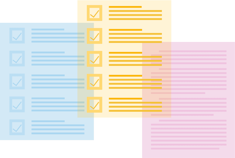
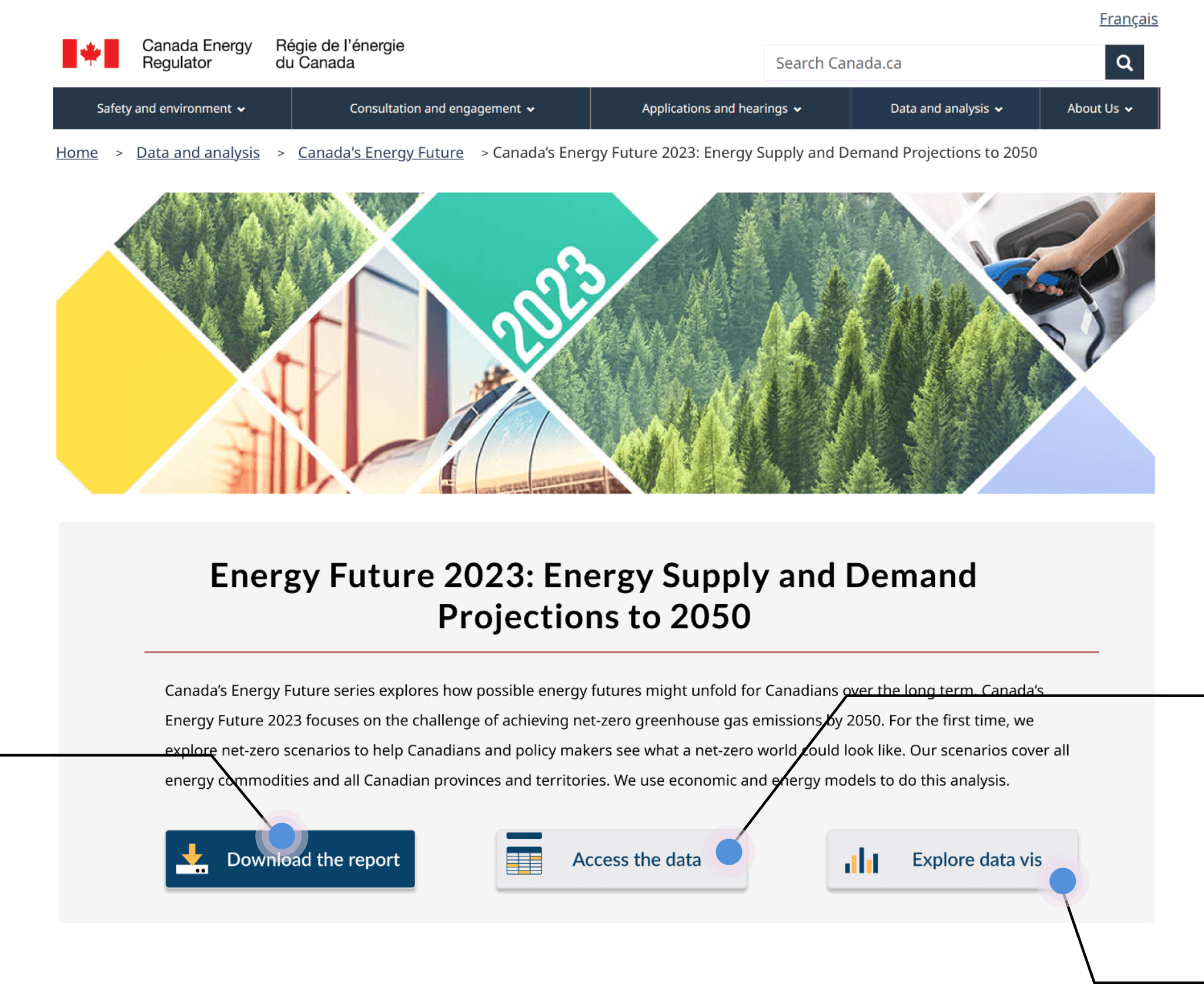
2️⃣ Quick data access was needed

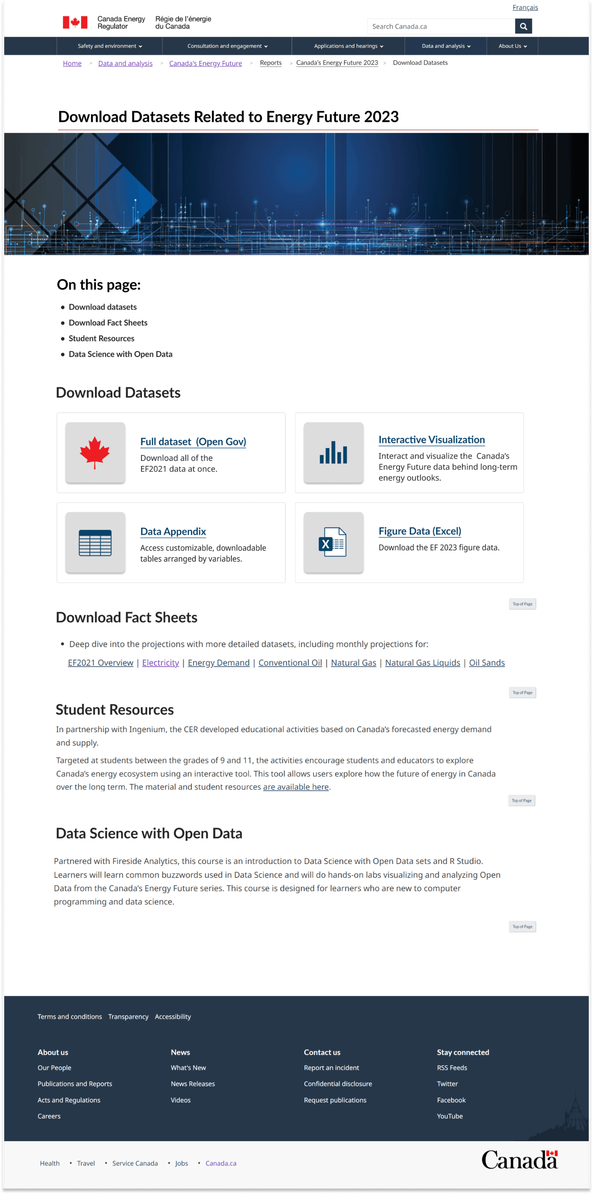
We learned that users primarily seek data, but previous versions did not prominently feature the data section on the landing page.


Our audience used our data for their own work and was interested not only in the end results but also in the analysis and the story behind the numbers. Since they often accessed the Energy Future report during work hours, quick and easy data access was important for them.

I need to quickly find the most important things while at work, and having quick access to data is important.

I need to quickly find the most important things while at work, and having quick access to data is important.

I need to quickly find the most important things while at work, and having quick access to data is important.

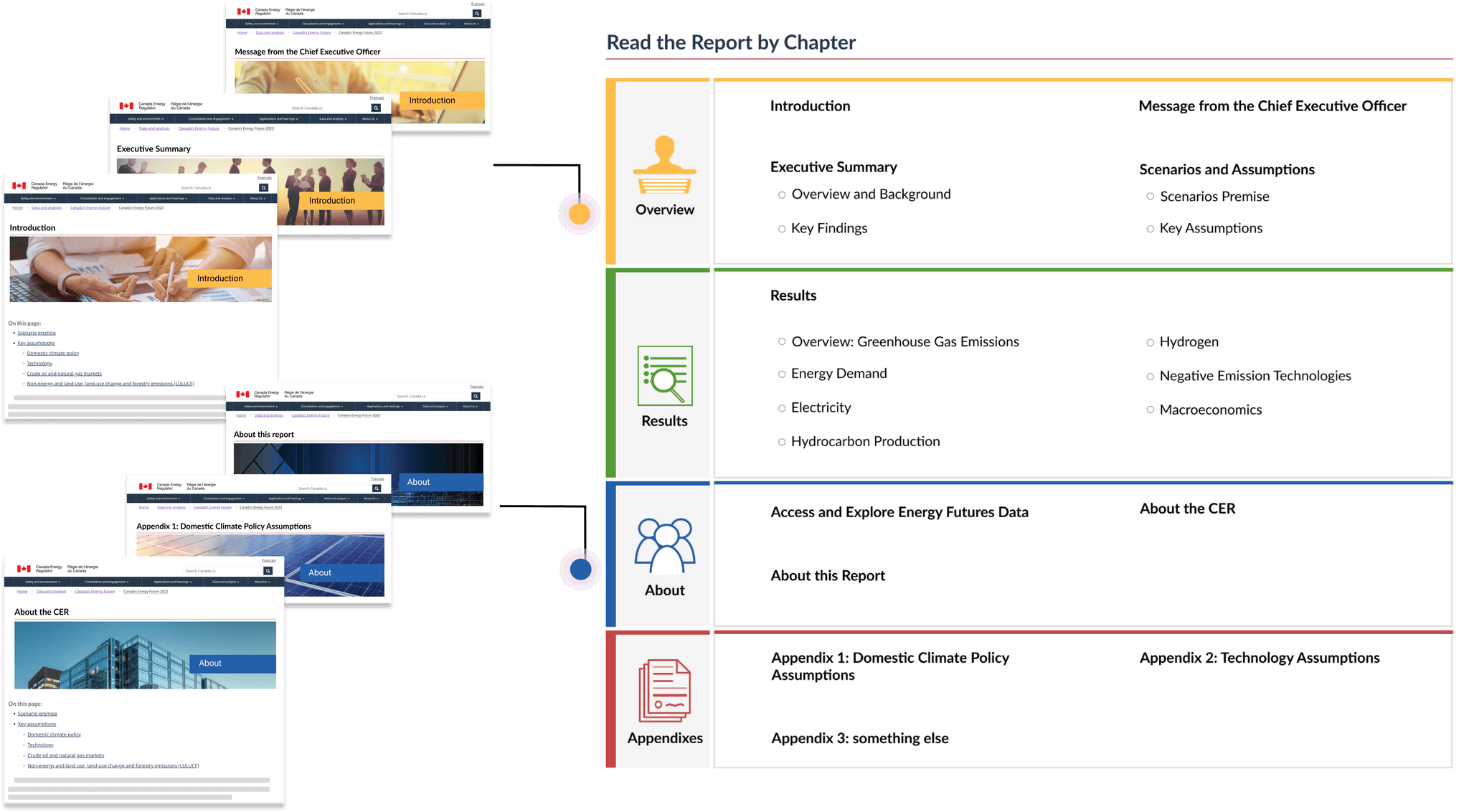
3️⃣ Better navigational indicators is needed to show page relationships

Due to the content-heavy nature of the webpage, users often struggled to navigate between pages. We observed that users frequently lost track of their current location while navigating through the information. This highlighted the need for a clearer display of the relationship between parent and child pages to improve usability.

“I felt once you get a few pages deep, it's difficult to get back to where you want it to be…and I missed the top menu.”

“I felt once you get a few pages deep, it's difficult to get back to where you want it to be…and I missed the top menu.”

“I felt once you get a few pages deep, it's difficult to get back to where you want it to be…and I missed the top menu.”

🤔 Ideation

How Might We redesign the landing page to incorporate a more linear and intuitive layout and clearly illustrate the relationship between parent and child pages?

How Might We redesign the landing page to incorporate a more linear and intuitive layout and clearly illustrate the relationship between parent and child pages?

Some less effective design iterations …

❌ Drop Down Menu

Requires too many clicks to get to information.

Some less effective design iterations …

❌ Drop Down Menu

Requires too many clicks to get to information.

Some less effective design iterations …

❌ Drop Down Menu

Requires too many clicks to get to information.

Some less effective design iterations …

❌ keyword search

Overly complicated and lacks visual appeal.

Some less effective design iterations …

❌ keyword search

Overly complicated and lacks visual appeal.

Some less effective design iterations …

❌ keyword search

Overly complicated and lacks visual appeal.

Some less effective design iterations …

❌ tabbed interface

Not effective for presenting a large amount of information.

Some less effective design iterations …

❌ tabbed interface

Not effective for presenting a large amount of information.

Some less effective design iterations …

❌ tabbed interface

Not effective for presenting a large amount of information.

✍️ Some less effective design iterations …

keyword search

Overly complicated and lacks visual appeal.

drop down menu

Requires too many clicks to get to information.

tabbed interface

Not effective for presenting a large amount of information.

💡 Design Inspiration

I took inspiration from the 'binder tabs' that are colourful and are used for labeling purposes.

I took inspiration from the 'binder tabs' that are colourful and are used for labeling purposes.

🎨 Design Solutions

Consistent colour coding are used across main sections and related child pages to enhance user navigation and content recognition.

🎨 Design Solutions

The three most requested items: the PDF report, data page, and data visualization tool are highlighted on the landing page and placed above the fold for quick access.

The three most requested items: the PDF report, data page, and data visualization tool are highlighted on the landing page and placed above the fold for quick access.

Download the report

Highlight the most requested PDF report.

Access the data

One click to the “all-in-one” data page for quick data downloads.

Explore data vis

Interact and visualize our analysis with the new interactive data visualization tool.

Download the report

Highlight the most requested PDF report.

Access the data

One click to the “all-in-one” data page for quick data downloads.

Explore data vis

Interact and visualize our analysis with the new interactive data visualization tool.

🎨 Design Solutions

The child pages feature in-page links for quick overviews and direct access to specific sections, along with an option to return to the main section of the report.

🎨 Design Solutions

Consistent colour coding are used across main sections and related child pages to enhance user navigation and content recognition.

🎨 Design Solutions

The child pages feature in-page links for quick overviews and direct access to specific sections, along with an option to return to the main section of the report.

On This Page

In-page links for quick overview and access to a specific section.

Option to exit

A quick link for going back to the main index.

On this page

In-page links for quick overview and access to a specific section.

Option to exit

A quick link for going back to the main index.

🩵 Final Design

💜 Final Design

🙌 Project Reflection

Iterate as much as you can.

In the beginning, I’ve explored so many design options to find the right design solutions. There were some constraints that limited my choices, so it took several iterations to figure out what worked and what didn’t. With each iteration, based on the feedback I got, the design got better and the best solutions started to stand out.

Involve stakeholders early.

Bringing stakeholders into the project early was a game changer. It helped me to align the project’s goals with the business needs right from the start and established a collaborative, feedback-driven process. It also sets up a good flow of feedback from the beginning, making the whole process more collaborative and aligned.

Team work are key.

Open communication is key when working with cross-functional teams. For this project, I found that by bringing everyone together for an ideation workshop was a game changer. It really helped to get the whole design team on the same page and made sure that everyone's idea was heard. Plus, involving everyone from the start not only keeps the team informed but also highlights how important our work is and the impact it can have.

Back To Top

Back To Top

designing experience that resonate

@2024 Iris Song

designing experience that resonate

@2024 Iris Song

designing experience that resonate

@2024 Iris Song

designing experience that resonate

@2024 Iris Song

Go Back To Top

Go Back To Top